Film logos are among the most enduring symbols in cinema. More than simple title cards, they define how a film looks and feels. Appearing on posters, merchandise and decades of promotional material, they carry the identity of an entire franchise.
Joe Caroff, the designer behind the famous 007 logo for the James Bond films, died on Monday at the age of 103. Here, we look at the story behind that logo, as well as seven more of the most unforgettable movie emblems and the designers who created them.
James Bond 007 logo: Joe Caroff
While James Bond may be best known for his cars, drink choices and theme music, one constant since the franchise began has been its logo. Caroff, who worked at David Chasman Inc, devised the 007 design in 1962 for Dr No, the first Bond film.
His design was striking in its simplicity – the number seven extended into the shape of a pistol, linking Bond’s code number directly to his role as an armed agent. Instantly recognisable, the logo has featured in more than two dozen official films, as well as posters, trailers and merchandise. Its longevity – with only minor adjustments in more than six decades – speaks to the strength of the design.
Star Wars: Suzy Rice, refined by Joe Johnston
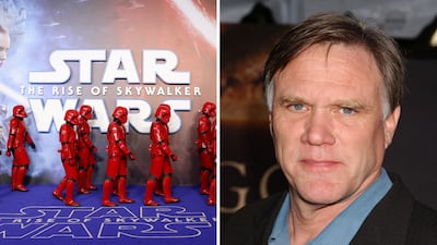
George Lucas asked designer Suzy Rice to create a logo for Star Wars that looked “fascist” in style, evoking authority and power. She produced a bold, blocky wordmark in all capitals for the original 1977 film.
Lucasfilm’s Joe Johnston later refined the design, adjusting spacing and proportions to improve balance. The revised version became the standard for the franchise, appearing on countless toys, clothes and collectibles since.
Superman: Joe Shuster
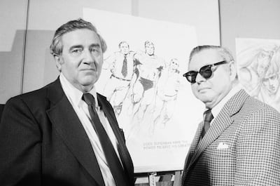
The Superman shield dates back to 1938, when artist Joe Shuster, co-creator of the character with Jerry Siegel, first drew a simple triangular emblem containing the letter “S”. It evolved into the red-and-yellow pentagonal crest now recognised worldwide.
Richard Donner’s 1978 film gave the logo a polished, three-dimensional update for the big screen. It has since been reinterpreted in comics and cinema alike, from Zack Snyder’s films to James Gunn’s interpretation inspired by the Kingdom Come DC graphic novel. Whether seen as the letter S or a symbol of hope, the shield remains one of the most recognisable marks in popular culture.
Jurassic Park: Chip Kidd
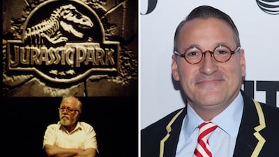
Before Jurassic Park was a film, Chip Kidd designed its logo in 1990 for the cover of Michael Crichton’s novel. The silhouette of a Tyrannosaurus skeleton inside a circular badge became the novel’s defining image.
When Steven Spielberg adapted the book in 1993, Universal retained Kidd’s concept, adding red, yellow and black colouring and distressed lettering. This continuity helped cement the logo across books, posters, toys and merchandise. More than 30 years and several sequels later, it remains virtually unchanged.
Alien: Stephen Frankfurt and Philip Gips
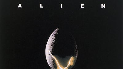
The 1979 sci-fi horror film Alien used one of the most minimal yet unsettling logos in cinema. Designers Stephen Frankfurt and Philip Gips presented the title in widely spaced capital letters, conveying emptiness and isolation.
On screen, the word “alien” assembled slowly during the opening credits, heightening the sense of dread. The stark typography set the tone for the franchise and continues to influence its visual identity, including in the most recent television show, Alien: Earth.
The Godfather: S Neil Fujita
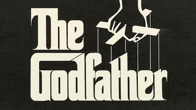
In 1969, graphic designer S Neil Fujita created the puppet-string logo for Mario Puzo’s novel The Godfather. Symbolising manipulation and control, it became an instant visual shorthand for the story.
When Francis Ford Coppola adapted the novel in 1972, the logo was retained for posters and marketing. Its simple black-and-white design has endured for decades, still appearing on anniversary editions and box sets today.
Batman: Bill Finger and Bob Kane
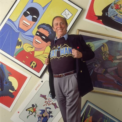
The first Batman emblem appeared in 1939, created by the character’s co-creators Bob Kane and Bill Finger. It showed a simple, stylised bat with outstretched wings on the hero’s chest.
For Tim Burton’s 1989 film, production designer Anton Furst and Warner Bros gave the symbol a striking update – a black bat inside a yellow oval, rendered in metallic tones for posters and merchandise. While the logo has been reinterpreted many times since, the original and the 1989 versions remain the most recognisable.
Ghostbusters: Michael C Gross
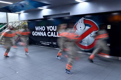
In 1984, Michael C Gross designed the playful yet unforgettable logo for Ghostbusters – a cartoon ghost caught inside a red prohibition symbol. It perfectly captured the film’s premise while serving as an instantly marketable image.
The design was cleverly adapted for the sequel, with the ghost holding up two fingers, and has since reappeared in reboots, cartoons, toys and video games. About four decades later, it remains one of cinema’s most enduring pop culture logos.


