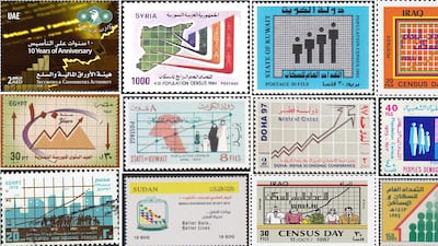

I recently came across an article published by the Data Visualisation Society's Nightingale magazine that captures a niche but wonderful corner of a largely bygone era of stamps, graphic design, and data visualisation as political communications.
Its author, Julie Peasley, assembled 180 stamps from around the world featuring charts and other data visuals from 88 countries. Among them are examples from across the Middle East and North Africa. Together, they offer a shed light into how the region's governments chose to illustrate growth through future projections and economic indicators.
I reviewed a set containing 38 entries from 14 countries from 1940 to 2015. Looking into the stamps, I uncovered a rich snapshot of the time the stamp was issued and the context behind the beautiful graphics, colours and charts.
Here are a few of the most striking and informative stamps.
Counting a nation
Census stamps were a common feature in the database. At the turn of the last century, many Middle Eastern countries' populations were exploding, and the administrative task of keeping track was a huge national undertaking. Many countries chose to mark these occasions with special commemorative stamps.
Iraq, 1987

Iraq's 1987 census stamp is a busy composition highlighting the diversity of the country, with illustrations representing rural and urban workers. Behind them, a line graph presents a population count through the visual language of a modern government.
But it's important to remember another context. According to Human Rights Watch, “the machinery of genocide was set in motion” against Iraqi Kurds in March 1987, and that year’s census became part of it ahead of the Anfal campaign. In that context, the stamp is a reminder that counting a population can also be a means of documenting who is wanted – and who isn't.
Egypt, 1976

Egypt’s 1976 population and housing census stamp brings people and their surroundings into the same frame. Combining the height of the construction boom showing a city scape in a turquoise backdrop, figures gather along the bottom and lines traverse a grid marked with years and numbers.
It was issued during president Anwar Sadat’s infitah, or “open-door” policy, introduced in 1974 to attract Arab and foreign investment. Egypt was changing its economic direction and the stamp’s buildings and statistical grid can be read as a small picture of that ambition to modernise.
Kuwait, 1965

Kuwait’s census stamp shows a family of four in traditional dress, beside a pink outline of the country and beneath a rising line chart, combining both a family portrait and statistics.
Issued in 1965, only four years after independence in 1961, it captures a country changing quickly.
Kuwait’s population had more than doubled since 1957, reaching about 467,000 by 1965, with non-Kuwaitis making up slightly more than half of its residents. Behind the simple family illustration was a much bigger story of oil, migration and the building of a modern state.
UAE, 1980

The UAE’s 1980 population census stamp is beautiful in its illustrative simplicity. A family stands against a pink grid, in traditional dress.
The UAE was still less than a decade old at the time and this count followed its first general census in 1975. In Abu Dhabi alone, the population more than doubled between those two counts, from about 212,000 to 452,000.
Economic growth
Qatar, 1997

Qatar marked the Mena Economic Conference of 1997 with a stamp featuring an artistic line chart, turning the visual language of economic growth into a commemorative and memorable design.
Held in Doha in November 1997, the conference belonged to a series launched in the wake of the Oslo Accords, with hopes that closer economic ties would support regional peace. The stamp’s optimism sits against a much more complicated political moment.
Egypt, 2003

Marking 100 years of the Egyptian stock exchange, the design combines a rising graph with a sweeping curved arrow. This shows a colourful composition of movement, fluctuation and forward momentum. The anniversary reaches back to the exchange’s establishment in 1903.
Progress in other ways
UAE, 1987

This UAE stamp, with “Growth Monitoring” written in Arabic and English, was issued as part of Unicef’s Child Survival Campaign, reflecting a major public-health push of the 1980s.
Unicef promoted simple, affordable measures – regular growth monitoring, breastfeeding, immunisation and oral rehydration therapy – to help more children survive their early years.
It is a strong example of data visualisation serving a practical purpose. Growth charts are still used today to track children’s development and spot when they might need help.
Sudan, 2015

Sudan’s World Statistics Day stamp takes a broader view of what data can do. Colourful triangles and circles accompany the phrase “Better Data, Better Lives”, putting the emphasis on how statistics can improve people’s lives.
The timing matters. In 2015, the UN adopted the Sustainable Development Goals, setting targets on poverty, health, education and much more. Reliable statistics were essential to knowing where countries stood and whether they were making progress. Sudan’s stamp carries the theme of that year’s World Statistics Day into a small, colourful design.