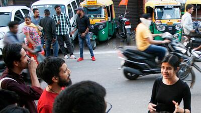
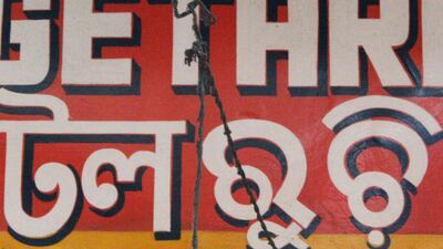
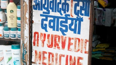
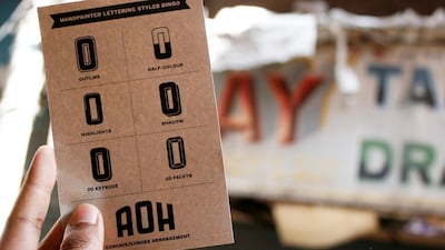
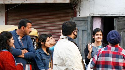
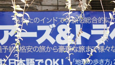
Pooja Saxena, one of India's best young typography designers, is explaining the intricate curves of the Hindi lettering on a shop sign when a left-turning scooter decides, with all the courtesy and patience of the New Delhi street, to plough unapologetically into my leg. We are walking (now more carefully) through the backpacking 'burb that is Paharganj and looking at the extraordinary range of signs and fonts that illuminates New Delhi past and present on a unique typography tour.
Paharganj, bookended on the walk by the glorious but derelict Imperial Theatre and the New Delhi Railway station, is a window into Saxena's enchanting world of lettering. "India is rich in the variety and styles in which public lettering exists and it plays a huge role in how we experience our cities," says Saxena as I dodge another scooter.
'The Hindi textbooks were uglier than other books'
It is difficult, and dangerous, to look upwards in most Indian cities, but doing so introduces us to a world that is often taken for granted as we explore the streets and their semiotics. Saxena belongs to a new group of typographers who are in this way engaging modern India, while attempting to modernise Indian fonts and confront an age-old problem – how to re-formulate non-Latin scripts for the printed and digital age.
According to the census of 2001, India had 122 major languages and 1599 'other' languagesHowever, figures vary greatly, primarily due to differences in definition of the terms 'language' and 'dialect'. But, irrespective of the statistics, writing and printing of Indian languages has long been problematic.
Saxena recalls being at school where "the Hindi textbooks were uglier than the other books, because there was just one typeface in which everything was set." She says the text was, for want of a better word, "squished".
"It's the Latin that gets designed first and so all the parameters are designed around a language system that is much simpler," she says. "Indian scripts had to fit into a system that it wasn't designed for – they were made uglier." More significantly, all scripts had to fit into a printable rectangular shape that meant the language did not appear in a way that native readers wrote it.
"The language could no longer be represented in a way that native readers wrote it." Crucially, "the way stuff looked changed," says Saxena. "In Hindi, for instance, most conjuncts, a half letter and a full letter, are written as a horizontal – whereas in a lot of older texts, they're written as verticals," says Saxena. "If we write by hand a half letter followed by a full letter, these will touch each other, but in older [printing] technology that was just too hard to do."
This is a global problem, of course. As Thomas S Mullaney wrote in his recent book, The Chinese Typewriter: A History, "Whether typewriting, Linotype, Monotype, each of these systems were developed first, and only later 'extended' to encompass non-Latin alphabets."
The underlying assumption was that a language that couldn’t be printed effectively was ‘incompatible with modernity’. More insidiously, some scholars suggested that such ‘inferior’ writing systems might even limit cultural development. Such proponents cite the so-called ‘strong hypothesis’ of the Sapir-Wharf thesis - that language limits thought.
How digital is helping make mother tongues 'cool'
Saxena says this can be challenged with digital technology, and it makes a difference to how people approach their own languages – and how they are perceived by others. "If people can see that the text looks beautiful, they will engage more with it," she says. "Digital has enabled you to have good Indian typefaces and you can, potentially, see them next to English content. My 12-year-old self would have seen it as cooler."
But how do you design a typeface in a language that you can't speak? The pioneering work of British type historian and designer Professor Fiona Ross in the 1980s, especially with the Linotype Bengali typeface, ushered in a new chapter in typography, and her Phonetic Keyboard for Indian scripts opened up a new world in desktop publishing.
Saxena studied under Ross in a Masters Programme at Reading University, and shares her professor's discomfort with the notion of 'non-Latin'. Saxena sees it as a further 'othering'. "Japanese and Devangari are non-Latin but there's nothing in common between the two – it's just Euro-centric," she says.
The collaborative spirit was also evident with Saxena's work on the Ol Chiki typeface. The script is the official writing system of the Santali people and is spoken mainly in Chhattisgarh, Jharkhand, Odisha and West Bengal. Only formally created in 1925, it isn't an Indo-Aryan language and Indic scripts simply didn't have all of its phonemes (perceptually distinct units of sound that distinguish one word from another). It was simply written with a Latin script.
Guru Gomke - a new, open-source typeface
Working with Subhashish Panigrahi, a respected community manager, Saxena helped create a free, open-source typeface, family-named Guru Gomke, out of respect for its original creator. It remains one of just two Unicode-compliant fonts with both bold and italic character sets, and the Latin glyphs included in it are derived from Source Sans Pro. She spent weeks writing Ol Chicki by hand for an hour every day "like a five-year-old" and sampling other people's writing to study the subtle differences between each letter.
For Saxena, this kind of design is an exhaustive, and exhausting, negotiation between tradition and modernity. It's also expensive and, as most Indian institutions or brands can't afford to commission work, she has catered more for non-Indian clients. There are government initiatives that specify all mobile phones sold in India should have Indian languages, but progress is slow.
However, it is a sector that continues to grow and several Indian foundries, such as the Indian Type Foundry, Ektype, Mota Italics, and several high-profile designers have employed a lot of younger designers from India, and abroad.
As dusk settles over Paharganj, we see signs in Japanese, Korean, Cyrillic and Hebrew. Neon signs flicker to life advertising cheap hotels, causing Saxena to enthuse about their history and their own special calligraphy. We duck down a side street and through a disorienting maze of buildings to find a restaurant sign written with no fewer than four Indian languages.
At the end of the tour, I greet the familiar facade of the New Delhi Railway Station with a new fascination. I look up again and, above the cacophony, a symphony of text and a melody of symbols previously ignored, dance with the car horns.
____________________
Read more:
The once war-ravaged Lebanese National Library finally set to reopen
