Pink – you either love it or can’t help but cringe when you see it. While I mostly relate to the former, I see how the hue can become a sickening sight. From Persian rose to carnation, salmon and Thulian, the shades of pink are countless. But be selective in the pinks that you welcome into your wardrobe.
Because pink can be a powerful colour, it should be sported in small doses. Don’t think denim-on-denim trend rules can easily be applied to pink. Go this route and you may end up looking like somebody’s chewed-up and spat-out bubblegum. That said, if your shade of choice is a subdued, pastel pink, you may be able to get away with a head-to-toe pink outfit – particularly if it’s a trouser suit or relaxed dress.
I’ll refrain from going on a gushing pastel rave, but as a general rule for this season, keep your pinks pale, unless you’re going for a deep, plush burgundy. Any shade in between is middle ground; a so-so hue in a sea of dazzling colour potential.
There’s a beautiful shade of pink in the current fashion air – it blew away the audience at New York Fashion Week last month when Carolina Herrera showed her collection for spring/summer 2016, and introduced an ethereal baby-pink hue on the catwalk. It was pleated, layered, embellished and texturised, giving the shade a rare, city-girl edge, where minimalism met femininity in a polished, put-together manner. These clothes – like the sheer maxi dress with a dually sheer slip dress underneath, brought in at the waist with a skinny rope belt – weren’t your typical girlie-girl ensembles – rather, the youthful shade was used to exude a fresh, mature and enviable attitude.
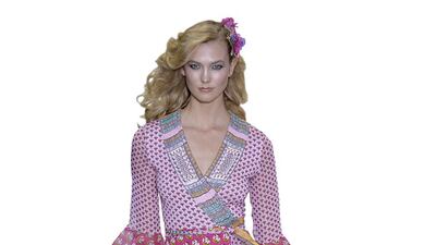
Diane von Furstenberg’s spring/summer 2016 collection shown in New York last month also incorporated quite a bit of pink, but the best design was the look worn by Karlie Kloss – a printed, layered wrap dress with a marvellous mishmash of ethnic-inspired prints. Mixed-print ensembles evoke an eclectic exterior on their own, so if you throw pink into the mix, it will amp up the volume – make sure you’re prepared to pull this off with panache, before buying into popping pink prints.
If you’re adamant about keeping bright, bubblegum shades away from your wardrobe, opt for tea-pink, and embody beautiful Victorian vibes, especially for autumn. For inspiration, look no further than Zimmermann. The label’s spring/summer 2015 collection is a celebratory marriage between shabby chic and haute Victorian elegance, complete with ruffles, lace and exaggerated bib necklines. These elements, shown in a colour somewhere in between tea-pink and a subdued rose tone, evoked images of both European dancers and severe madams of past eras – a contradictory combination that resulted in quite a remarkable collection.
At times, we shudder at the sheer thought of wearing pink, while at other moments, we note the gaping space between our reds and blues, and yearn to have some pink tones in our wardrobe.
Remember when Rihanna donned that strawberry-pink-coloured Giambattista Valli couture cupcake dress at the Grammys earlier this year? Do you recall getting that dubious feeling, the same one you get when hesitating before liking an image on Instagram? That’s exactly the kind of peculiar sensation I get sometimes when a pink ensemble is put in front of my face. For some of you, perhaps a pink lip is enough for that rosy touch. Or take a step ahead of international fashion bloggers, look to the bucket-bag brand of the moment – Mansur Gavriel – and buy your own from Boutique 1, in a pretty pink shade.
hlodi@thenational.ae

