I've been involved in a few newspaper launches in my time, both in Britain and the UAE, and there is only one golden rule: the founding designers and editors should expect to see all their ambitious, visionary plans get ripped up the moment the first "dummy" edition is produced.
The Independent of London, where I was a reporter when it launched in 1986, was intended to be a new departure in daily journalism, the first broadsheet launch in decades and the first designed for the then "new technology" era.
From the perspective of today, the "new" element seems almost laughable - the use of electronic keyboards to set type rather than the old "hot metal" process. But it was certainly cutting-edge back then.
No matter: The Independent that eventually appeared was a bit like The Daily Telegraph with a shot of the old Manchester Guardian in it. So much for the radical vision.
The last launch I worked on in the UK was the move by The Observer (part of The Guardian stable) away from standard broadsheet size to "Berliner" format (midway between broadsheet and tabloid). The business section, which was my part of the project, was designed to have the feel of The Wall Street Journal.
Again, no matter: when it eventually appeared, it had lost all those Journal characteristics and looked just like a miniaturised Guardian.
There seems to be an immutable law of newsprint that standardises even the most radical of redesigns.
In the UAE, the process was even more noticeable. I worked on the relaunch of the old Dubai tabloid Emirates Today, which was to become, according to the very expensive design team hired to oversee the transformation, a "radical innovation in Middle East news publishing": a daily news magazine, loaded with high-quality graphical content with a business slant but also a commitment to "lifestyle" content that would mark it out from the rest of the staid, rather worthy but dull business press.
The newspaper, Emirates Business 24/7, that eventually appeared fell well short of those ambitions. It has long since disappeared as a print product and is now a rather racy online publication, with celeb news sitting oddly alongside formal statements from the UAE Central Bank. But the website is better than the newspaper was, that's for sure.
Anyway, all this is a rather long-winded way to contextualise a new entrant into the UAE media market that approaches the newsprint dilemma from a different angle.
The Islamic Globe is not a newspaper. Some media experts believe there will be no more newspaper launches, ever again. I personally think this is wrong: the fast growing parts of the world such as China, India and South America are hungry for information but still comparatively poor on technology. From Shanghai to Mumbai to Sao Paulo, in the words of Irish musician Van Morrison it'll still be: "rave on words on printed page".
The Globe, the first edition of which appeared last week, is a full fledged e-newspaper, available on iPhone, iPad, BlackBerry, Kindle, Samsung Tablet, and PDF: anything really, as long as it's not newsprint.
It is a specialist publication for the fast-growing Islamic finance industry. "Much of the media that has addressed this market in the past has been filled with regurgitated press releases and advertiser-friendly PR," says Paul McNamara, its founder and editor. "The Islamic Globe seeks to tell the truth with no bias and no slant." Brave words indeed.
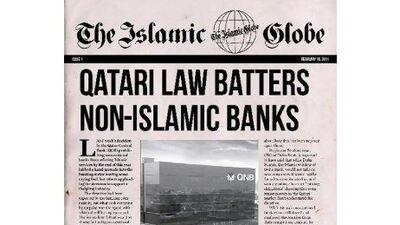
But it is the "retro" look of the product that is unique, and has given me second thoughts about newspaper design. "The e-paper is designed to look like an old-fashioned newspaper from the 1950s," says Mr McNamara, "complete with yellowing paper and curled edges, to remind readers of a time when quality journalism was the most important part of the newspaper experience." Again, a brave mission statement.
The first edition certainly has the authentic 1950s feel: big Gothic banner on the front page; battered-looking pages with a slight pink tinge (FT-inspired?); an old-fashioned editorial column "The Globe Says" (London Sun-inspired?), a "Letter from America", even a crossword. Quaint.
The content strives to be provocative, leading with a strongly-worded "views" story about Qatar's recent decision to stop conventional banks from dealing in Islamic products, followed by several stories that, from my position of non-specialist expertise about Islamic finance coverage, seem to offer something new.
There is a nice turn of phrase too. "Theologically inspired Gordon Gekkos" caught my eye.
It's a nice-looking package, certainly on the PDF version I saw. It will be interesting to see how it translates to BlackBerry and iPad format. All that elaborate serif typeface, which I like, might lose some of its impact on the small screen.
It will be interesting to see how long the founders' commitment to the "old fashioned" look lasts. If it proves to be a turn-off for readers, will they just dump it in favour of standardised e-communication formats, without all the bits of newspaper nostalgia?
And if so, will the commitment to "no bias and no slant" follow it? I hope not.

