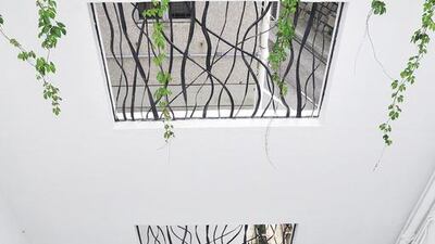
When Anthony and Susan James designed their first home together, they had two distinct requirements: lots of space and lots of light. Luckily, space proved to not be an issue – the couple had purchased all three apartments in a block of flats in Hong Kong's Pok Fu Lam district, with the intention of transforming them into a spacious, three-storey house.
Although the flats were in pretty dilapidated state when he saw them, Anthony was able to recognise their potential, and made a snap decision. “I bought the top two flats at the same time, in one inspection on one night,” he recalls. “I sensed that there was something to be done with the place.”
Securing the final element took a little more time. Buying the ground-floor flat – which had its own garden – was not quite so easy. “It took a while longer; it took some negotiations,” he says.
Initially, his wife wasn’t entirely convinced about the place. “The middle floor was really dark,” she explains, adding that the rooms were also quite poky. She came around, however, when a feng-shui master proclaimed that the house was perfectly laid out for Anthony.
The pair quickly set about redesigning the space, working with the architect Inge Strompf Jepsen as their project manager. Covering a total area of 4,500 square feet, it features “five-and-a-half” bedrooms and four bathrooms, plus a rooftop garden and courtyard area.
The focal point of their design was a central courtyard around which the building was structured. “I think a lot of people would have gone ahead and closed off the courtyard and taken the risk,” Anthony says. “But I wanted the whole project to be legal.”
The decision proved to be a sound one – the couple now love spending time in this private outdoor space, as do their twin daughters. Initially, they thought about turning the courtyard into a swimming pool. “It was too much for the space, though,” Anthony says. “It would have been interesting visually, but that’s about it. It got pretty hard from the loading perspective.” Instead, they opted for a vast, outdoor bathtub that can be filled with piping-hot water. “We always end up sitting in the tub, even when it’s empty,” Susan says.
The tub was one of many design concepts that unfolded organically. The design for the kitchen, for example, took on a life of its own. “My original idea was to go uber-modern; that idea lasted two days. Whereas Susan wanted to make it into some kind of Umbrian kitchen,” Anthony says.
In the end, the kitchen they chose was somewhere between the two – a modern yet country-style kitchen filled with simple, classic, white cabinets, an expansive island and snowy, white stone floors.
The resulting impression is one of pure light and clean lines. This feeling continues throughout the rest of the home, too, thanks to the bleached, white oak floorboards in each room, and the touches of black here and there, in the form of a wrought-iron banister and window frames. “The aim was to be very consistent with the materials. If you get it wrong, it’s wrong all the way through,” Anthony says. “Once you get it right, you can get away with a lot of things.”
To warm up the space, the pair offset the sleek white-and-black look with wooden elements and bright splashes of colour. Curving wooden arches hug the staircase, adding personality to the simple, white corridors. The arches were Anthony’s idea, and were inspired by a converted chapel, Susan says. “The honey-coloured wood worked really well with the black and white.”
Also adding warmth and colour to the home are built-in powder-blue shelves in the dining room, while artworks in hues of metallic blue, grass green, pomegranate and sun yellow brighten every room. “I’m big on colour,” Anthony says. “Given a free rein, I would’ve gone wild with colour. Susan helped me keep to a really neutral palette. It’s such a big space, you lose your cohesive feel otherwise.”
Similarly, Susan kept Anthony in check when it came to adorning the walls. “I got really excited about murals. I would’ve put them everywhere,” he admits. “Eventually I was talked down to one.” The mural in question – white flowers in bloom set against an aubergine-hued background – decorates the sliding doors of the wardrobe in the master bedroom.
Another unique design element in the home is a striking Piet Mondrian-inspired wall feature. The latter was designed as a unique way to hide a door in a small outdoor enclave and the maid’s quarters. “I came up with the Mondrian idea, and Inge designed it,” Susan says.
Both Anthony and Susan adore the space, and have loved every minute of living in their family home. But they agree that this is just the beginning. “There’s a lot more you could do with the space,” Susan says. Her husband concurs: “We barely scratched the surface.”
* Red Cover
weekend@thenational.ae
Follow us @LifeNationalUAE
Follow us on Facebook for discussions, entertainment, reviews, wellness and news.

