The Premier League is 30 years old this season and kits are somehow bolder and brasher than ever.
Stephen Nelmes ranks each of the club's 40 kits (combining home and away) from worst to best. Browse all of the kits in the photo gallery above by clicking on the arrows, or if using a mobile device, simply swipe.
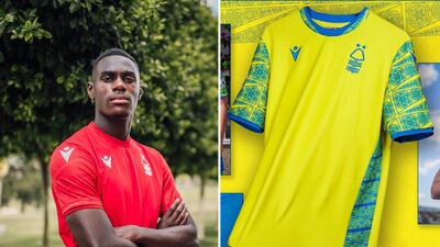
20. Nottingham Forest
A bit of a Sunday league effort from the two-time European champions. Forest's home shirt suffers from a lack of sponsor and being supplied by Macron sports. The sleeves on the away kit feel a bit like bathroom wall tiles from the 70s. The colour scheme resembles a bottle of Jif bleach cleaner from the same era.
19. Tottenham Hotspur
An anodyne home strip paired with an offensive training top-style away kit that looks patched together. I don't understand why they have felt the need to centre both the cockerel and the Nike swoosh.
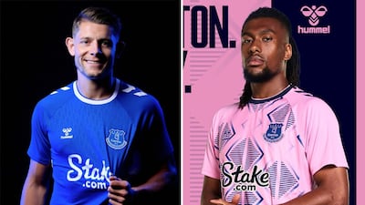
18. Everton
Pink away kits were vogue about five years ago. We get it, men's sports teams can look great in that shade, but they weren't made to work with garish diamond prints. The Everton home shirt is not really up to much. A rare poor effort from Hummel.
17. Southampton
The south coast clubs - Bournemouth, Brighton, and Southampton - have all gone for seaside-themed away kits this year. Southampton's is the least attractive and seems inspired by Hokusai's The Great Wave off Kanagawa. A nice idea but an ugly colour choice. The single stripe home kit is an OK throwback to the early 80s.

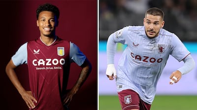
16. Aston Villa
Unspectacular home shirt with minimal effort going into the away kit.
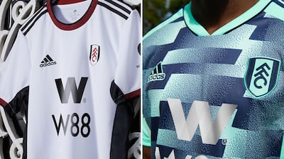
15. Fulham
A no-nonsense Adidas home kit for the yo-yo club. But the away kit falls into the Arriva bus seat upholstery category. There will be at least one Fulham supporter pictured wearing this kit sat on a bus with the same pattern this season.
14. Manchester United
It feels like Adidas panicked and needed to justify the (checks JD Sports website) £70 cost for the United home shirt. So they slapped on a collar that has no business being on it. The away kit is spot on. Not sure about the badge being embossed on an ironed-on pentagon.
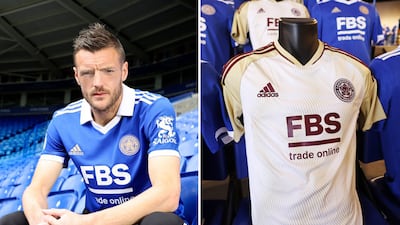
13. Leicester City
Another standard but understated home kit from Adidas. The white/cream/maroon away kit is a nice combination.
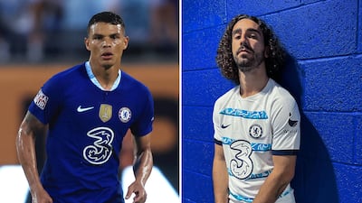
12. Chelsea
JD Sports describes Chelsea's home kit as combining a hint of "rush blue" with the more alarmingly "chlorine blue." The away kit hasn't been revealed yet, but if it's the one that has been widely "leaked", it will divide opinion. It has more of that "chlorine blue" than your local swimming bath. The younger Fifa 23 video game player type will love it. Early millenials and older will probably not.
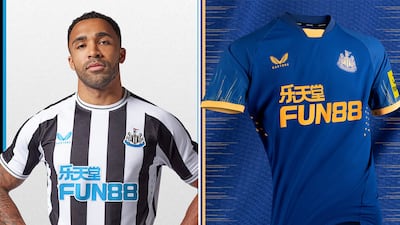
11. Newcastle United
Castore have learned their lesson with narrower black and white stripes that avoids last season's "Number 4 faux pas" - a result of the sponsor's logo, a thicker black stripe and a for some reason a white strip in the middle of that. The away kit is confident and plays off Boca Juniors colours.
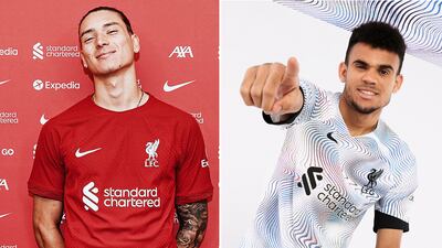
10. Liverpool
A fairly clean, no frills home kit from last season's runners-up. The hijinks comes in the form of the club's funky away strip and a homage to the city's 90s dance scene. I quote: "Liverpool’s away shirt harps back to a time when its clubs ruled the world, with an iridescent, multi-coloured marbled pattern over a white base colour." The nightclub Cream was certainly pumping back in the day, the same can't be said of the Spice Boys generation.
9. Leeds United
A crisp home strip. There's an excellent synergy between shirt, sleeves, trim and sponsor. Everything is acting in unison. The away kit is a little more rogue. It's a decent colour scheme, but the pattern is a bit out there and it doesn't quite come together. A hit and a miss.
8. Wolves
The best pair of shirts produced by sportswear newcomers Castore. The old gold home kit is clean and classy. I'm a big fan of the away kit. Wolves opt for a mid-90s green away kit that you could imagine club legend Steve Bull smashing in his 25th goal of the season in. Just a shame their not sponsored by Goodyear.
7. Brentford
Brentford's home strip is fairly run of the mill. It's also the same shirt they wore for the 21/22 season. Remember those halcyon days when clubs only released new kits every two or three years? You have to get behind that sort of sustainability. The Bees pair it with a smashing little strip that sports their alternative castle badge. This too will be around for a couple of seasons.
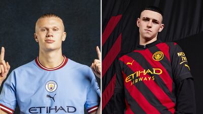
6. Manchester City
The champions have gone sentimental this season with a burgundy trim around their sky blue shirts and have doffed their cap to the Colin Bell era of the late1960s with other accessories and details. The away kit is City's beloved red and black stripes but set diagonally for a modern twist. Here's the story why they went all Milan back in 1968.
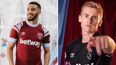
5. West Ham
A nice home kit from the Hammers, but the shoulder pattern is doing just a little too much for me. The bottom of the sleeve looks like it is cutting off blood circulation. The black away kit is another fantastic effort from Umbro. This one comes with colourful geometric shapes on the bottom of the sleeves.
4. Arsenal
Another solid home shirt. The collar works on this Adidas kit compared to Man Utd's bolted on job. The away kit is sublime. Black and bronze is an unusual mix and receives extra marks for using the cannon rather than the full badge.
3. Brighton & Hove Albion
A very bold and vibrant home kit. The yellow accent just does enough to bring the whole kit to life without going over the top. Brighton's away kit plays on the seaside theme too. The orangey-red sunset strip has more going on with it than first meets the eye.
2. Bournemouth
Two very different kits. Bournemouth win the battle of seaside-inspired away kits this season with their palm trees pattern. The blue-purple scheme is fresh. The red and black home shirt is a modern take on the Cherries kits from the 90s and will be remembered for years to come.
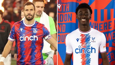
1. Crystal Palace
Wow. Palace rarely turn out in bad kits. This season they top the league by some distance. The felt-tip or crayon scrawl is a very playful take on traditional stripes. Both are marvellous. There's even a black third kit of the same motif that completes a memorable set. The only argument you have is deciding which one should be the home kit.
