Q: The colour yellow is notoriously difficult to incorporate into an interior. Is it possible to introduce this shade in a subtle way? Are there certain hues that you should combine it with,and are there any major no-nos when it comes to using yellow in one’s home?
A: It is no surprise that yellow has been named the world's happiest hue. It can bring sunshine into a space. It is uplifting and bright, and supposedly liked by intelligent people who appreciate innovation and originality. Having said that, it also happened to be one of the trickiest colours to use in interiors because of its high levels of brightness.
So how does one incorporate it in interiors? I always recommend using it as an accent colour in small touches, be it in lamps, cushions or throws.
India yellow, mustard and ochre are beautiful shades that are making a strong comeback, especially in fabrics like velvets, which give a comfortable feel and sense of warmth to an environment.
When it is used in a modern interior, with muted palettes of charcoals, greys and natural wood, yellow immediately counterbalances any dullness and adds life to a space. One way to do this is by opting for yellow dining chairs instead of your typical neutrals. You can also imbue an all-white room with hints of yellow here and there. Imagine a bedroom with crisp white linen and just one throw pillow in yellow. That pop of colour will create just the right amount of freshness.
Alternatively, you can pair bright yellow statement pieces, like a rocking horse, for example, with a palette of jewel tones, including variations of emerald, aqua blues, purples and red, for a peppy, vibrant and visually engaging kids playroom. Equally interesting, and trending now, is a combination of mustard yellow, in bedding for example, with toned-down pinks and mint green walls, plus black and white patterns. This combination will work particularly well in children's rooms. The added benefit is that this colour combo is suitable for both boys and girls rooms.
Navy blue is charming with yellow, too. It plays the role of a dark neutral, but is not as harsh as black. Together, yellow and navy blue create a timeless, classic look. You can, for example, upholster the front of an armchair in solid yellow and complement the back of it with a patterned navy and white fabric. The combination is elegant and trend transcendent.
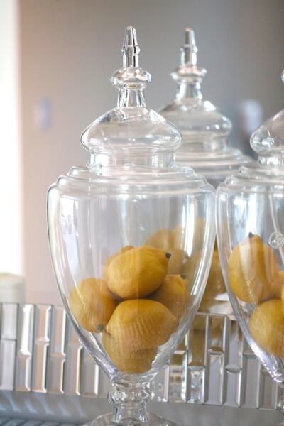
Feeling adventurous? Why not DIY and paint an outdated cabinet or mirror frame in a bright glossy yellow? Now that would be a conversation starter. You can even simply paint a huge canvas in your favourite shade of yellow and sign it for a one-off bespoke art piece. Additionally, you can introduce yellow through simple natural elements, like jars of lemons or by placing craspedia, tulips, solidago aster or sunflowers in simple glass votives.
All of the above suggestions tackle accessories, but you are in no way limited to those. You can use yellow on your walls, but in muted tones like ochre and butter. Jotun’s Anonymous 1864 is a good solution, and will brighten a dark corner where natural light might not reach. You can even apply it as an accent to white tiles in a bathroom. Imagine a thin strip of small yellow tiles set against larger white tiles. This will invariably create strong visual impact.
So, no matter what your style is, contemporary or traditional, you will find that yellow works beautifully in interior schemes. It is incredibly versatile, so just remember when you are looking for the perfect shade that you can pick one that is sharp and bright or soft and muted, depending on the aesthetic you are looking to create.
Nisrine El Lababidi, founder, Harf Noon Design Studio, @harfnoondesignstudio, www.harfnoondesignstudio.com


